Designing the moments people trust with their money.
7+ years shaping banking products end‑to‑end — from Birbank's savings, lending and verification flows to Yelo Bank's Internet Banking platform. I sit inside the product team, not beside it: research, UX, UI and delivery, one continuous loop.
I'm a product designer working across the full lifecycle of financial products. Most of my career has been spent embedded inside agile product squads at two of Azerbaijan's largest digital banks — Birbank and Yelo Bank, where design isn't a handoff but a continuous conversation with engineering, compliance, and research.
I currently lead design for Yelo Bank's Internet Banking platform, focused on usability and satisfaction at scale. Before that, at Birbank, I designed and shipped retail lending, savings products, transfers, loan order and personal cabinets.
- Focus
Senior UX/UI Designer
Yelo Bank ASCLeading the design and optimization of Yelo Bank's Internet Banking platform, enhancing usability and user satisfaction across the full retail experience.
Product Designer
BirbankWorked within an agile structure, collaborating directly with the product team to research, design, test and deliver retail products — savings accounts, digital deposits, loan ordering and digital verification.
Graphic & UI/UX Designer
The Ministry of Communication and High Technologies — Data Processing CenterLed UI design with accountability for the design system, collaborating with product and development teams on core projects to improve interfaces and experiences across public digital services.
Bachelor of Communication and Design (COMD)
Bilkent University — Ankara, Turkey · 2013 – 2017Included in the Honour and High Honour Rolls across multiple academic years for academic achievement, and graduated with an Honour Certificate.
Savings account
Discovery, education, e‑signature, biometric verification and goal‑based personalization for Birbank's savings product.
Read the case study →Cash loan personal cabinet
Post‑loan debt visibility, repayment schedules and in‑app payment initiation for existing credit customers.
Read the case study →Loan order
Discovery, option selection, configuration, transparency, KYC and disbursement for Birbank's cash loan and debt‑consolidation flow.
Read the case study →Sidebar and Header redesign for Internet Banking
Categorizing a sidebar that had outgrown itself as Yelo Bank's Internet Banking feature set kept expanding.
Read the case study →Mobile POS order
End-to-end onboarding flow for Yelo Bank's Mobile POS service — from the promo offer to a signed, confirmed order.
Read the case study →Guarantee order
Tender guarantee application for Yelo Bank business customers — from an e‑tender link to a signed, confirmed guarantee.
Read the case study →Pre-drive inspection fee
Bulk vehicle inspection fee payment for Yelo Bank business customers — every contract, every vehicle, one confirmation.
Read the case study →Savings account
Birbank
The flow
Seven screens carry the customer from discovery to a funded, personalized goal earning interest. Each step removes one reason to abandon.
Products listing
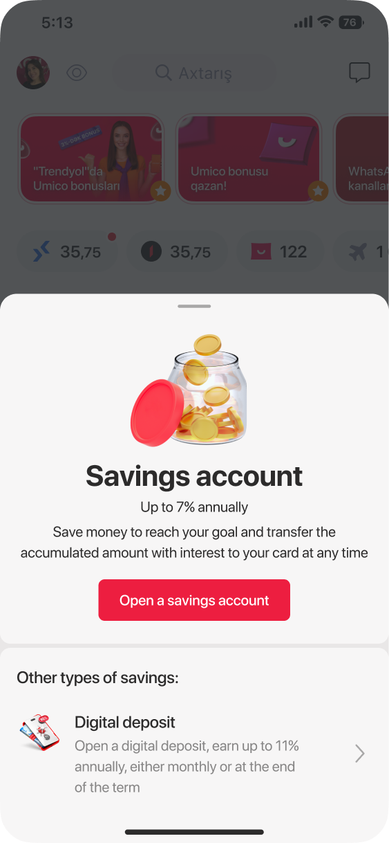
The products are introduced as a bottom sheet from the home feed itself — the business side highlights the new product
Product info
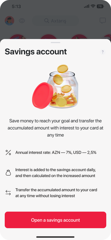
Rate, compounding and withdrawal terms are stated plainly, with a digital deposit shown as the one relevant alternative — no product‑catalogue sprawl.
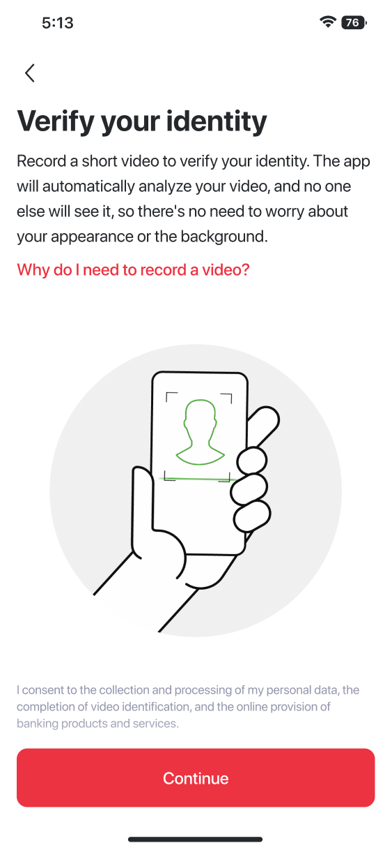
Branch‑free KYC
A short self‑recorded video replaces in‑person verification. The copy is deliberately reassuring about privacy — this is usually where trust breaks down.
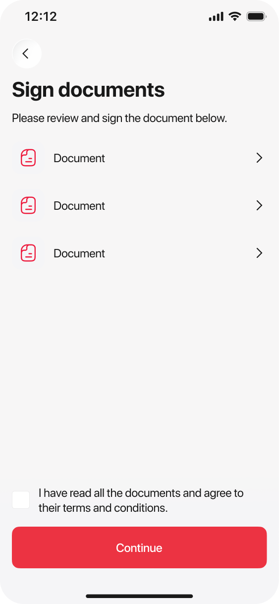
Sign, don't visit
Every document required to open the account is reviewed and e‑signed in‑app, replacing what used to be a paper stack at a branch counter.
Product cabinet
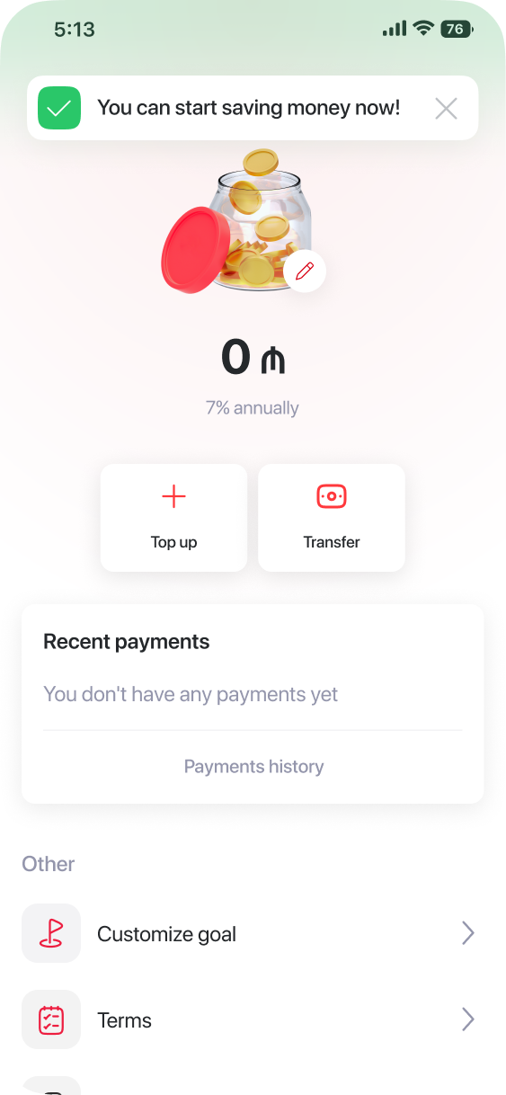
The product is introduced as a bottom sheet from the home feed itself — the rate and the benefit lead, before any commitment is asked for.
Goal customization
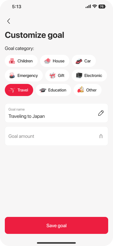
Before the account even exists, the customer names what it's for. A category and a target amount turn an abstract percentage into "Traveling to Japan."
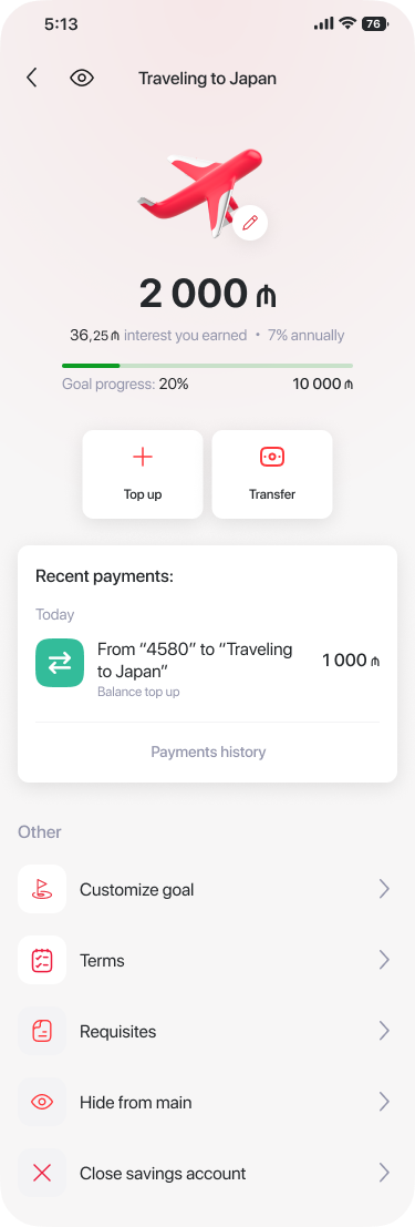
The goal, funded
After the first top‑up, the home screen becomes the goal itself — progress bar, interest earned, and payment history all framed around "Traveling to Japan."
Loan order
Birbank
The flow
Nine screens carry the customer from a home‑feed loan tile to approved, disbursed cash — with a debt‑consolidation option surfaced before a plain new loan.
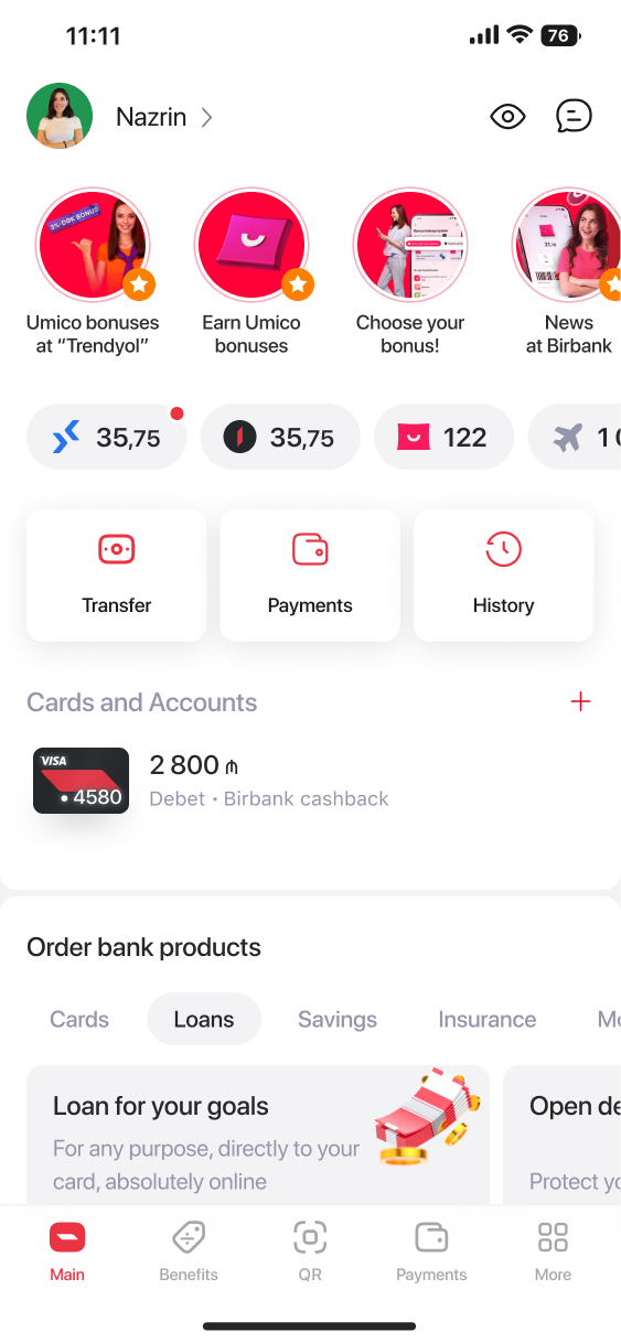
A tile, not a menu
The loan product sits inside the "Order bank products" tab the customer already uses for cards, savings and insurance — not buried in a separate section.
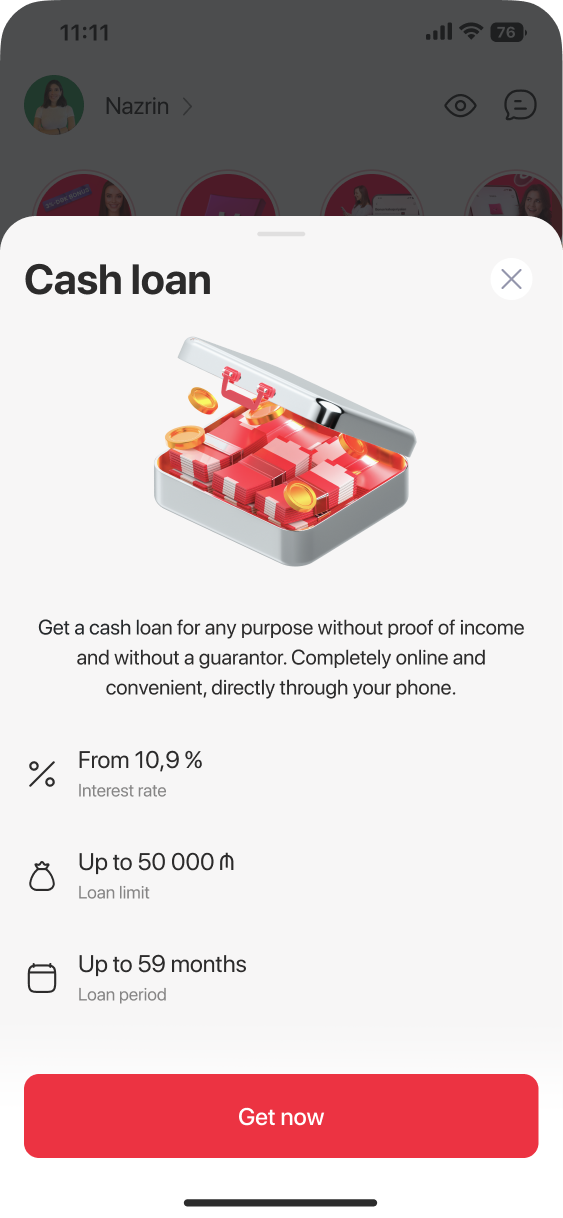
Rate, limit, term
The same three numbers that matter for any loan — from 10.9%, up to 50,000 ₼, up to 59 months — stated before anything is asked of the customer.
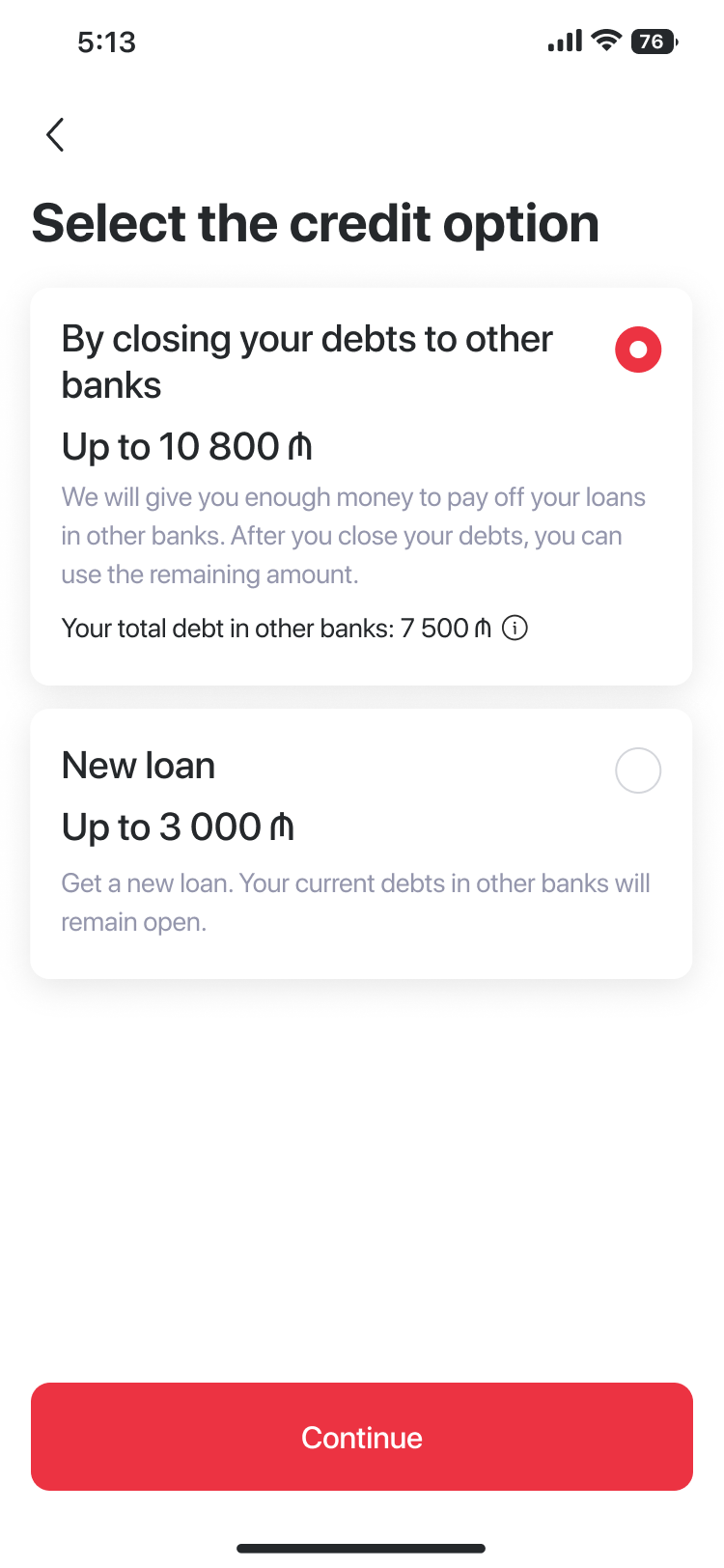
Consolidate or borrow fresh
Customers with debt at other banks are offered a consolidation path first, with their existing balance shown inline — a plain new loan is still one tap away.
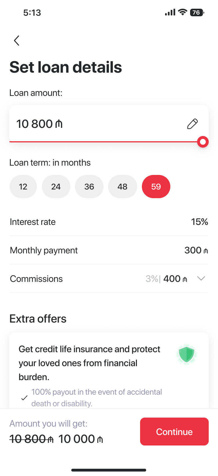
Every cost, before consent
Amount, term, interest, monthly payment and commission are all visible on one screen, with the strikethrough showing exactly what the fee changes.
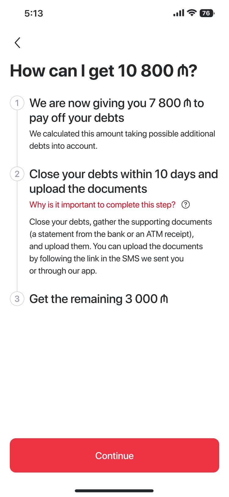
Where the money actually goes
For consolidation loans, a numbered breakdown shows what pays off other banks now versus what arrives after debts are closed — removing the "wait, why isn't it all mine?" moment.
The same trusted step
Loan applications reuse the same branch‑free biometric verification as the savings flow — one consistent moment of trust across every credit product.
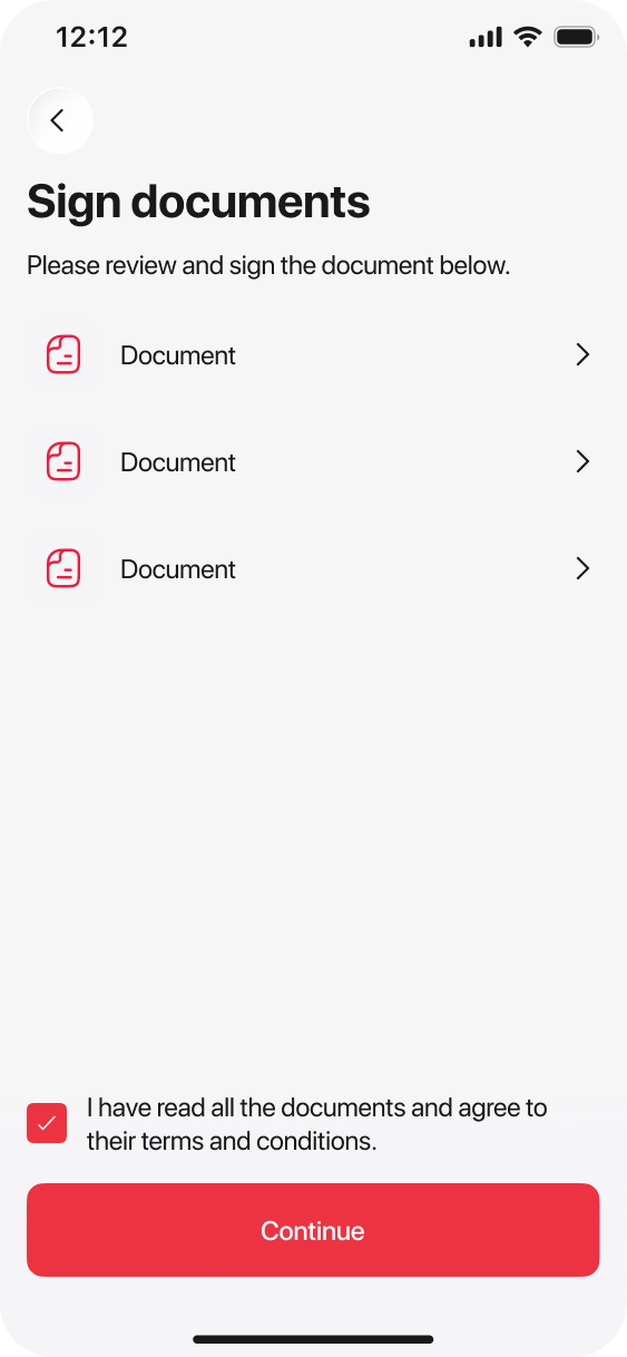
Reviewed and signed
The loan agreement is reviewed and e‑signed in‑app, the same consent pattern the customer already learned from other products.
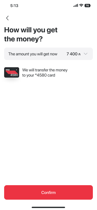
Choose the payout, confirm once
The customer sees the exact amount they'll receive now and which card it lands on, then confirms with a single "Təsdiq et."
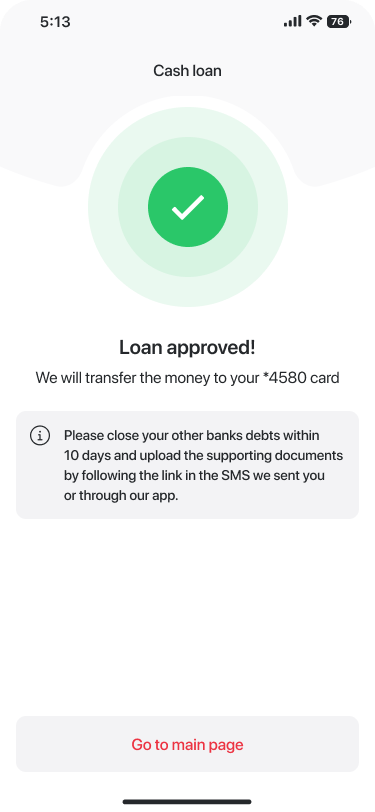
Clear next step, not just a checkmark
Approval is confirmed instantly, with a plain reminder of the one remaining action — closing other banks' debts within 10 days — instead of leaving the customer to wonder what happens next.
Cash loan personal cabinet
Birbank
The flow
Three screens carry an existing borrower from "what do I owe today" to a fully transparent repayment schedule and back to a reassuring, paid‑ahead state.
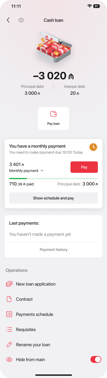
The one number that matters
On a payment day, the cabinet leads with the exact amount due and a countdown, with Pay one tap away — no digging through statements.
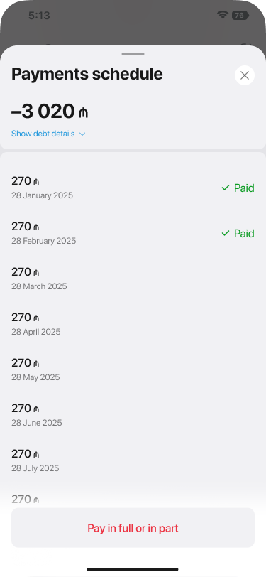
Every future payment, laid out
"Show schedule and pay" opens the full installment list with dates and amounts, plus the option to pay in full or in part — replacing a phone call to support.
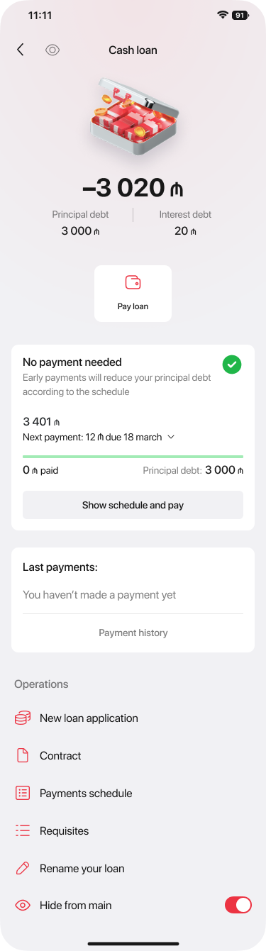
A different state, not a hidden one
Once a customer pays early, the same screen switches to a calm "No payment needed" state with a green check — confirming the early payment actually worked.
Sidebar and Header redesign
Yelo Bank
The problem
Internet Banking's sidebar was built to list features as they shipped, one flat item after another. That worked fine early on — but every new feature meant one more line in an already long list. By the time the feature set matured, the sidebar was a wall of icons with no hierarchy: a customer signature product like HÖP (government payments) sat visually equal to a settings link, and finding anything meant scanning the whole column.
Before → After
The fix wasn't to add more items — it was to group the ones already there. Related actions now live under a shared category the customer can expand or collapse, so the default view stays short even as the underlying feature count keeps growing.
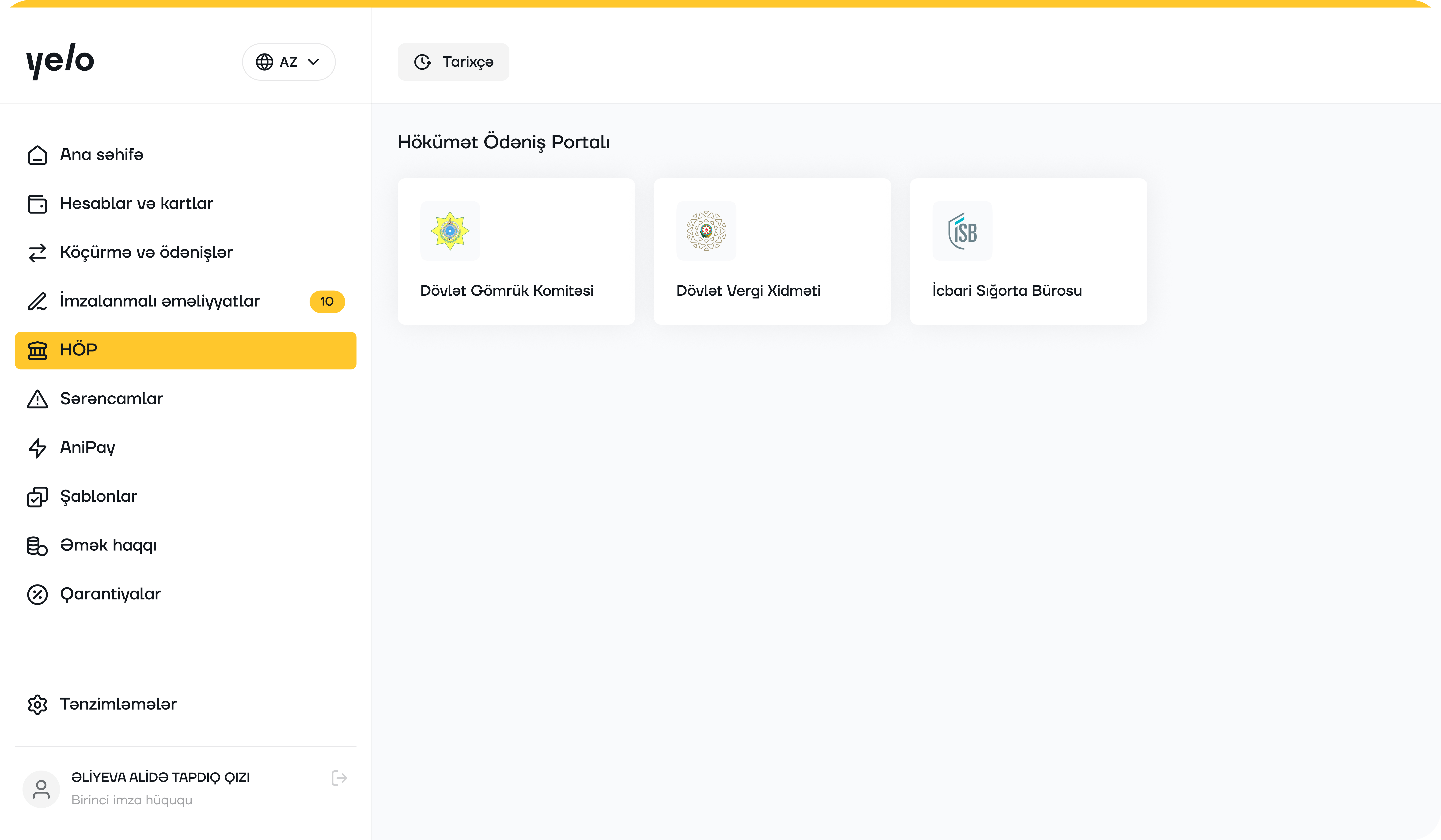
One long column
Every feature — transfers, payroll, guarantees, templates, government payments — sat at the same level, in the order it happened to ship.
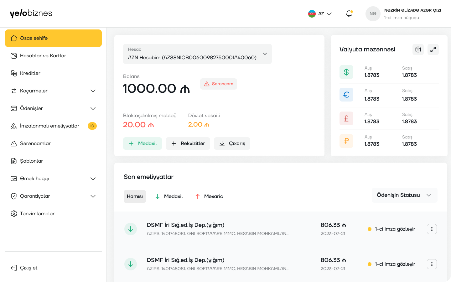
Grouped by task
Transfers, payments, payroll and guarantees each collapse into their own category, cutting the default list roughly in half without hiding anything a click away.
What else changed
The header picked up the pieces the old one was missing at this scale: a live currency indicator, a notification bell, and the account holder's name and signature right paired together instead of split across the layout — small additions that matter more once a business account has more than one signer.
Mobile POS order
Yelo Bank
The flow
Eight screens carry a business customer from a promo offer to a signed, confirmed Mobile POS order — with the State Tax Service check and receipt details handled before any signature is asked for.
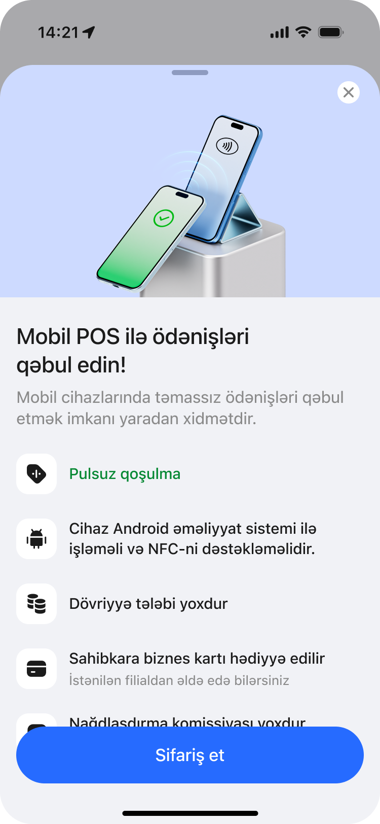
One offer, one action
Mobile POS surfaces as a bottom sheet from the home feed, leading with the perks — free onboarding, no turnover requirement, a complimentary business card — before asking anything of the customer.
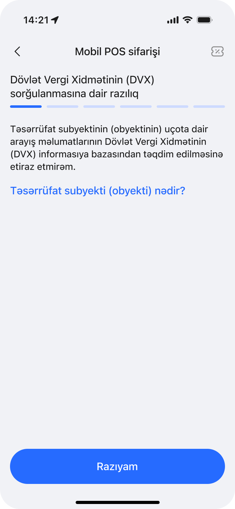
One data check, made explicit
Before any paperwork starts, the customer explicitly consents to a State Tax Service (DVX) lookup on their registered business, with a plain-language explanation of what an “economic subject (object)” means one tap away.
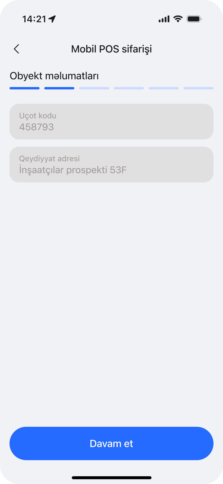
Confirm what's on file
Account code and registered address are pulled in automatically and shown for confirmation, removing manual entry for details the bank already holds.
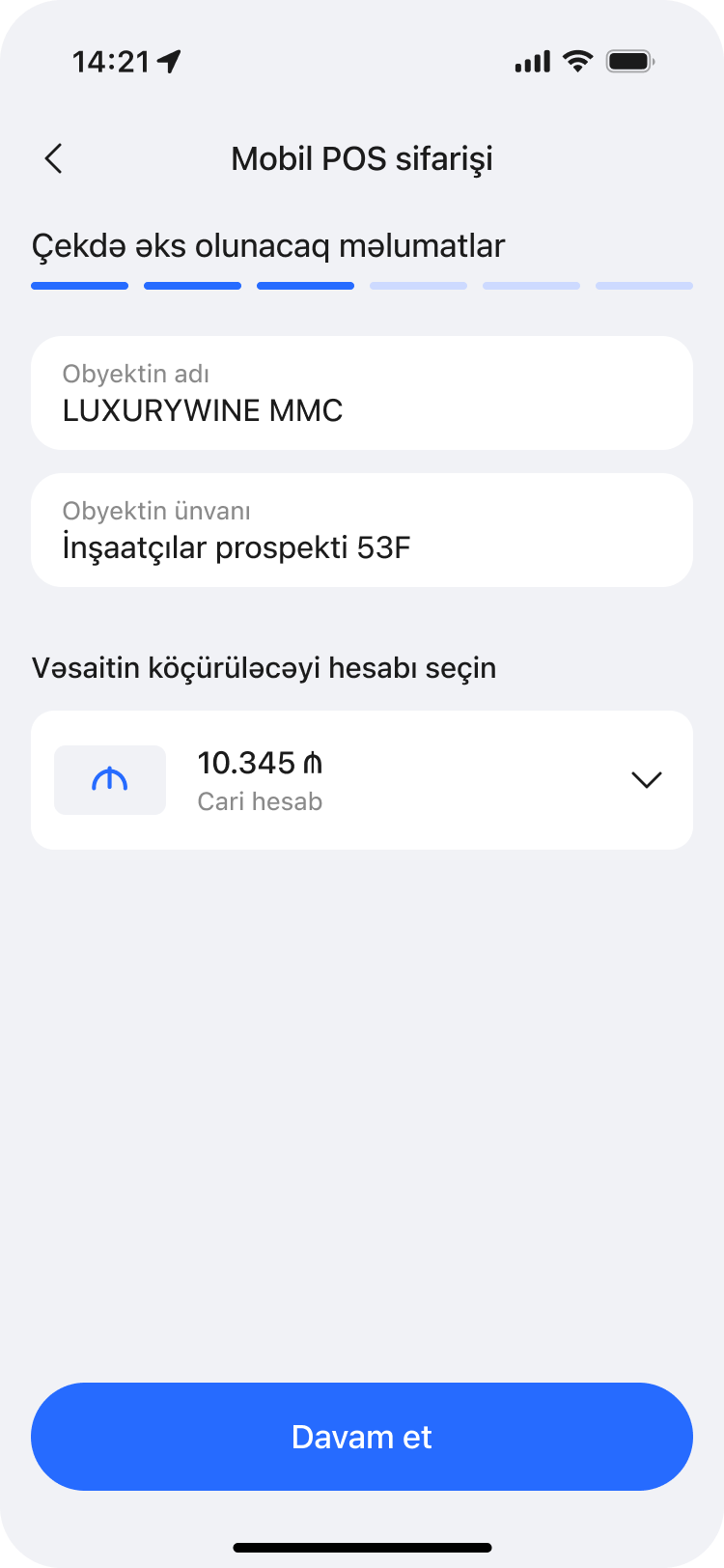
What the receipt will say
Business name, address and the settlement account are set here — the exact details that will print on every customer receipt — with the account defaulting to the customer's current account.
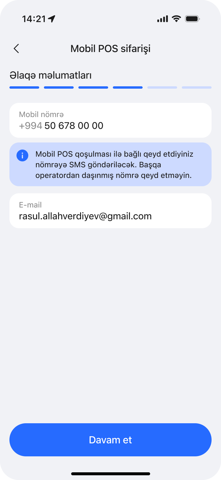
Where the setup instructions land
A mobile number and email are confirmed for delivery — the same number that will receive the activation SMS — with a reminder not to use a number registered to another operator.
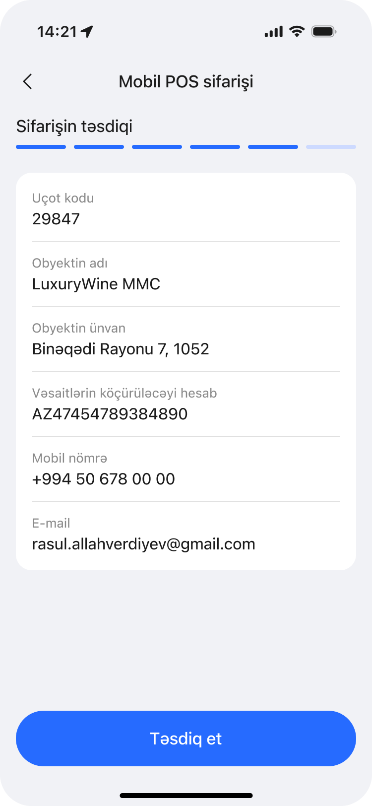
Everything in one place
Every detail collected so far — account code, business name and address, settlement account, phone and email — is shown together for a final check before signing.
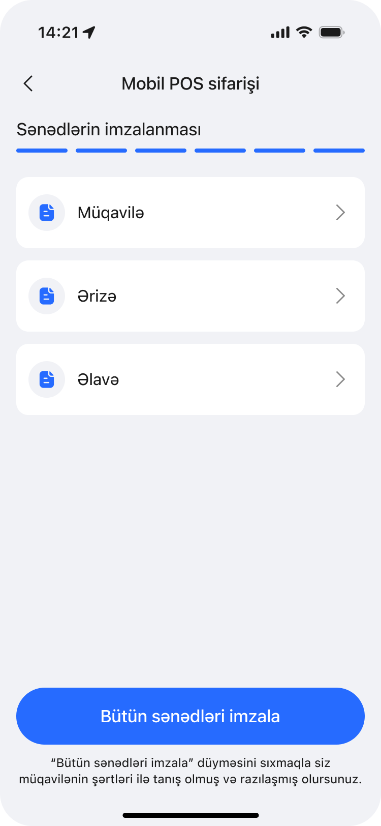
Sign, don't visit
Agreement, application and appendix are reviewed and e-signed in one tap, the same in-app consent pattern used across other Yelo Bank products.
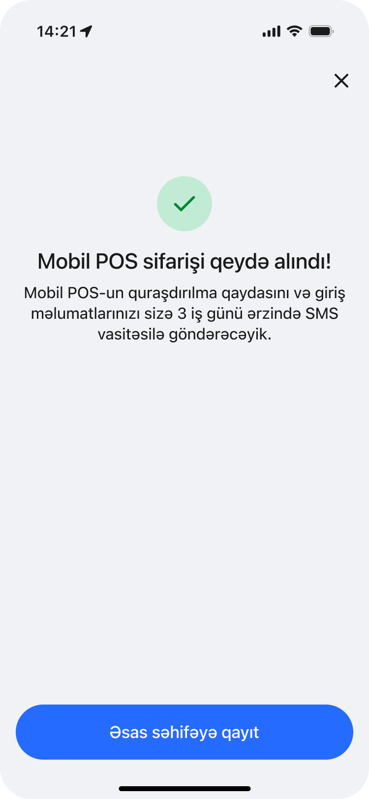
Live in three business days
The order is confirmed instantly, with a clear expectation set: setup instructions and login details arrive by SMS within three business days.
Guarantee order
Yelo Bank
The flow
Seven screens carry a business customer through applying for a tender guarantee — from a promo card in the sidebar to a signed, confirmed application, with terms and collateral handled on the bank's side rather than the customer's.
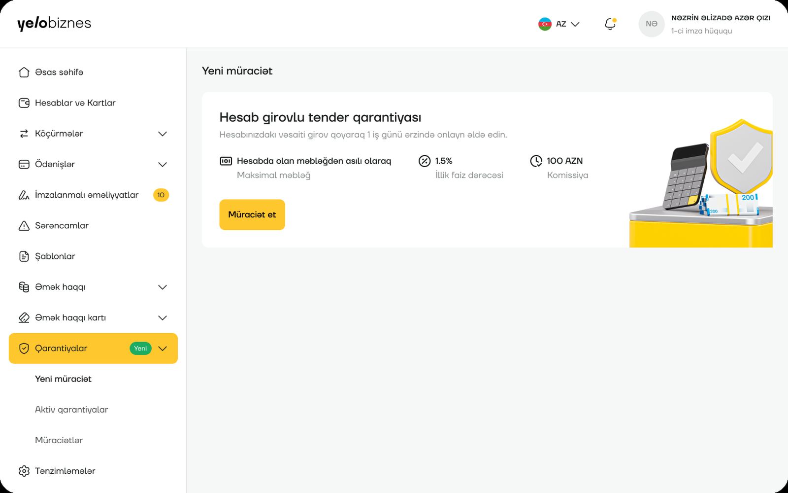
Surfaced from the sidebar
The guarantee product appears as a promo card the moment a business customer opens the new Qarantiyalar section — rate, limit and commission stated up front, before any form starts.
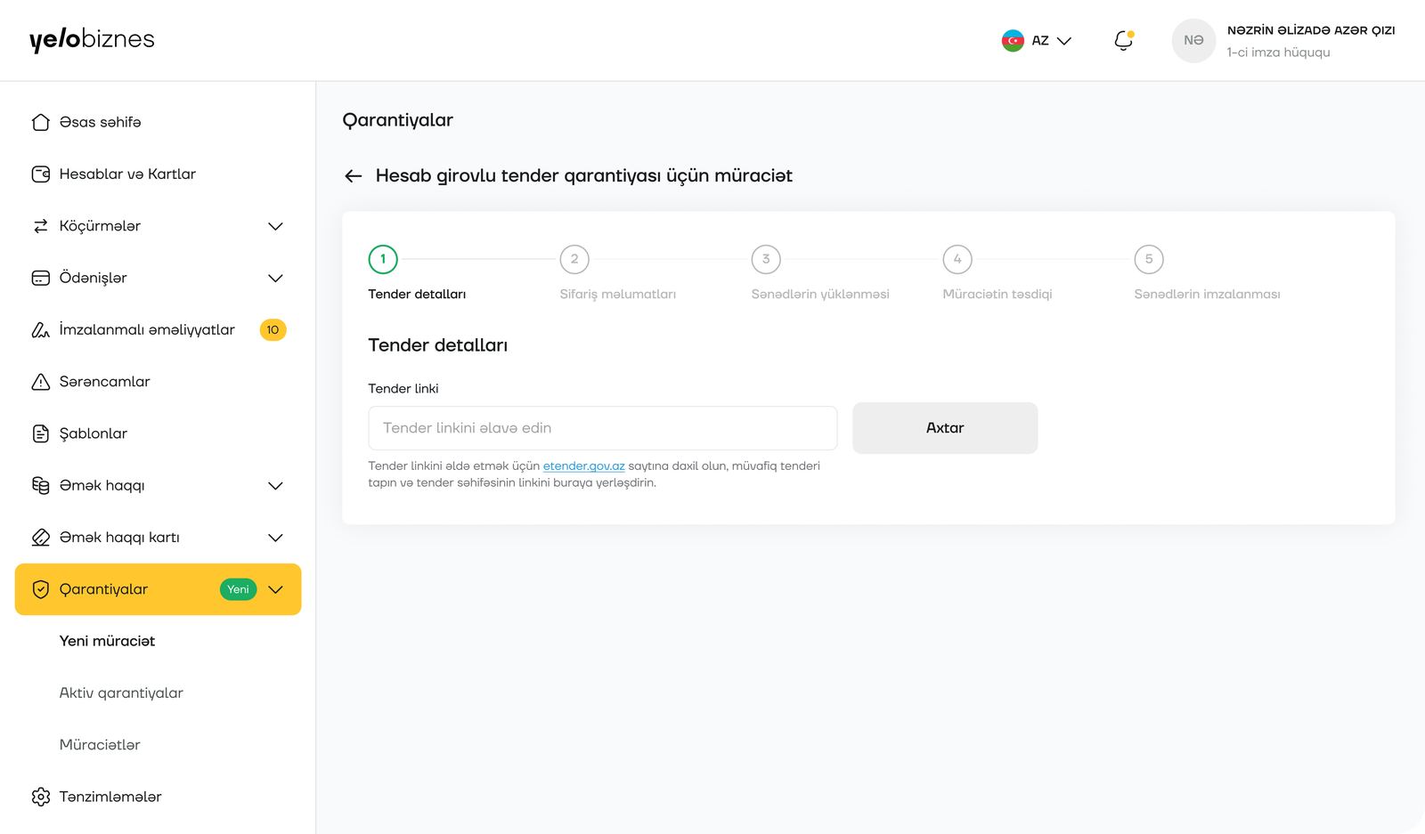
One link, not a form
The application starts with just the tender's public link from the e‑tender portal — not a re‑typed copy of details that are already published elsewhere.
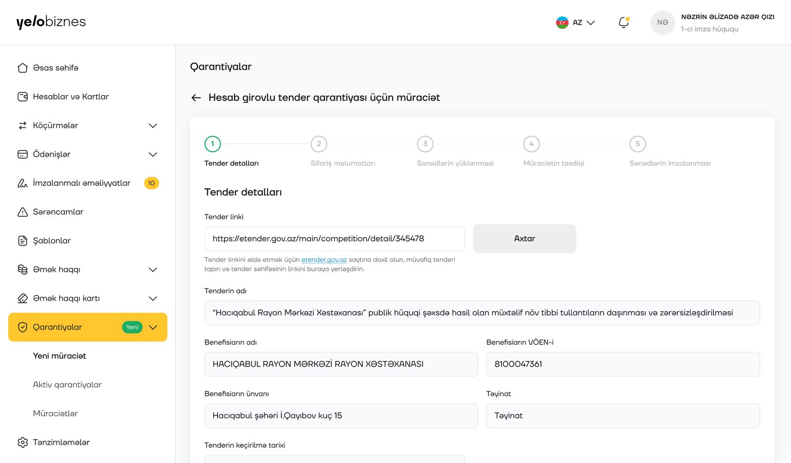
Details pulled, not typed
Once the link resolves, the tender's name, beneficiary, VÖEN and address populate on their own — the customer reviews rather than transcribes.
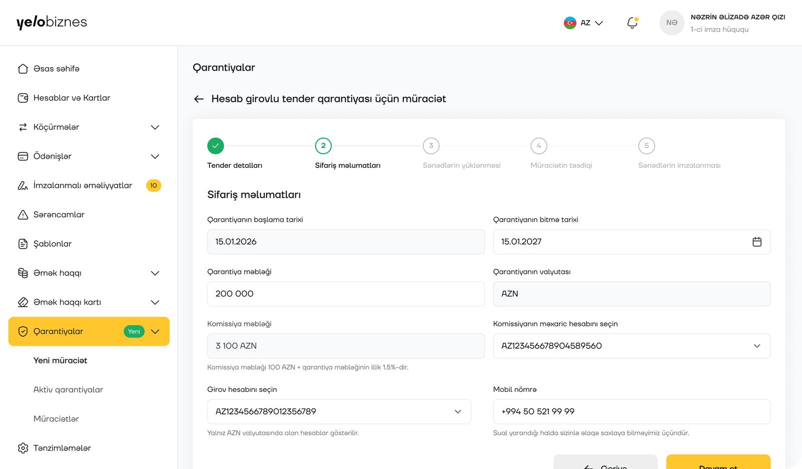
Terms and collateral, one screen
Guarantee dates, amount, the automatically calculated commission, and which account to draw from are all set here before anything is signed.
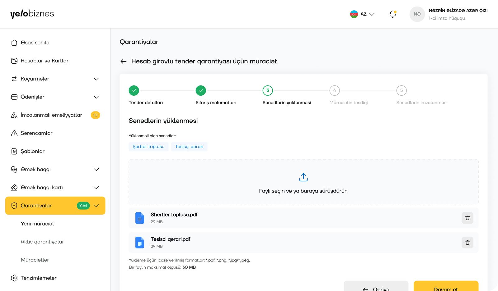
Upload only what's missing
Just the two documents the bank doesn't already hold — the terms package and the founding decision — need uploading, with clear format and size limits.
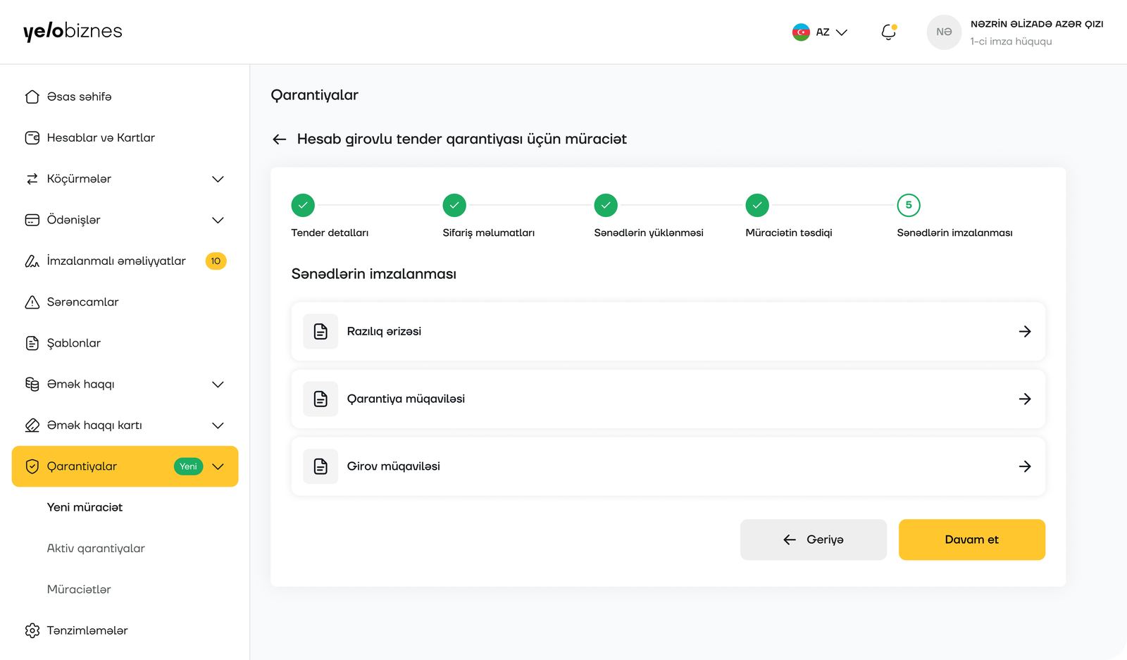
Three documents, reviewed in place
The consent application, guarantee agreement and collateral agreement are each opened and signed without leaving the flow.
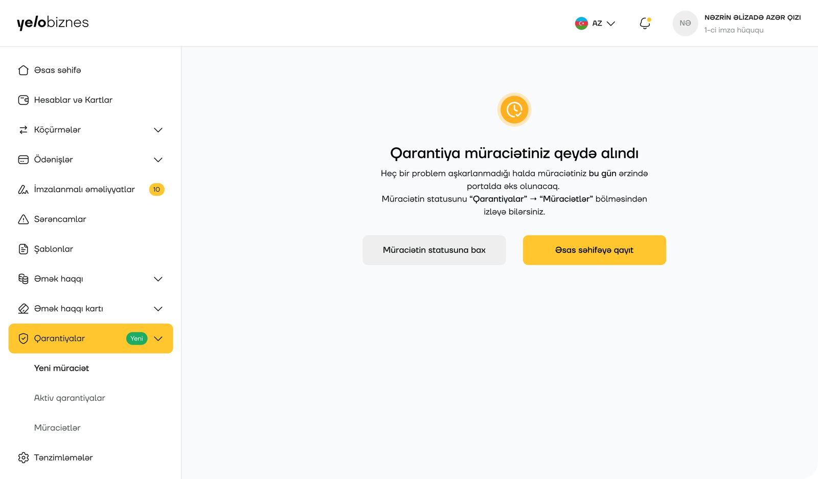
A same-day promise
The application is confirmed instantly, with a plain expectation set — it will appear on the portal the same day — and a direct link to track its status.
Pre-drive inspection fee
Yelo Bank
The flow
Three screens carry a business customer with a vehicle fleet from a list of contracts to a single confirmed payment — covering every vehicle's inspection fee at once instead of one at a time.
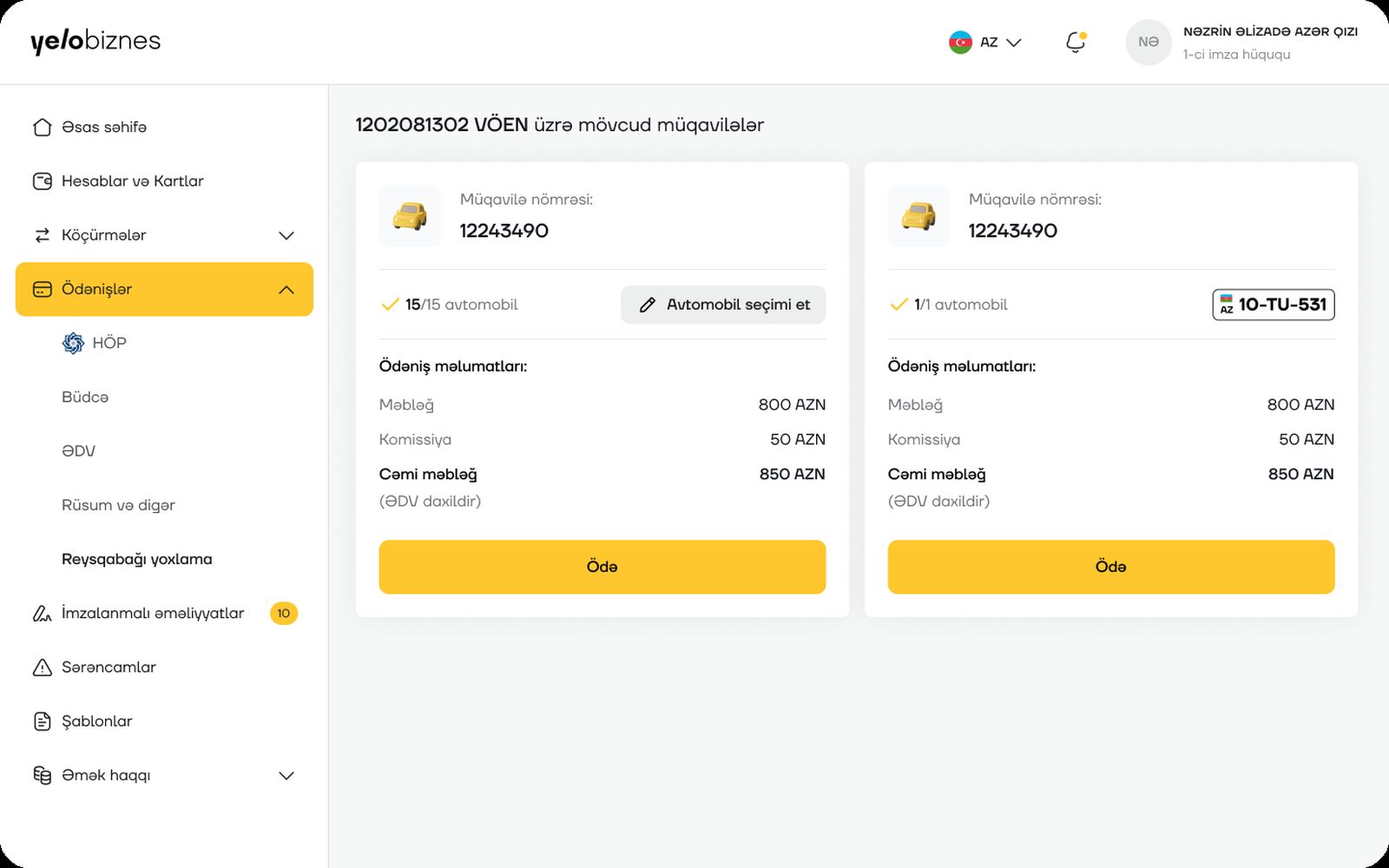
Every contract, one view
Business customers see every active vehicle‑fleet contract tied to their VÖEN, each with its own vehicle count and pre‑calculated total, before choosing which to pay.
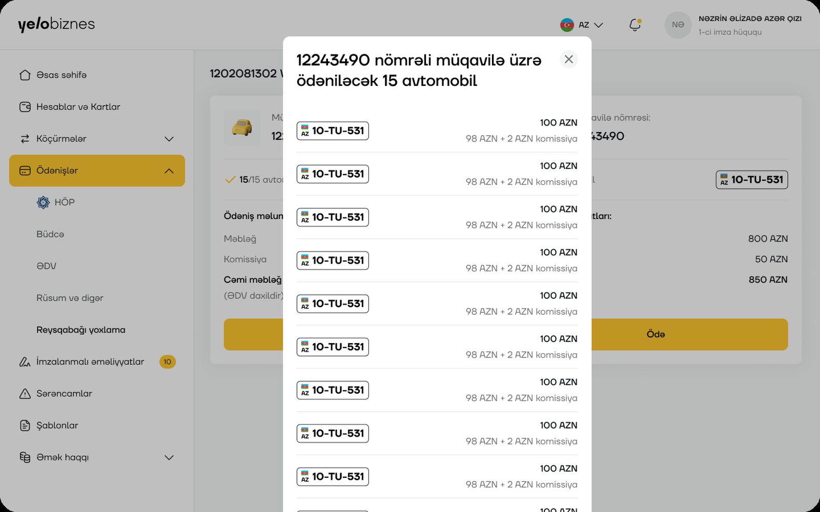
Every vehicle, itemized
Tapping the vehicle count opens a full breakdown — each plate number with its own fee and commission — so nothing is paid as an opaque lump sum.
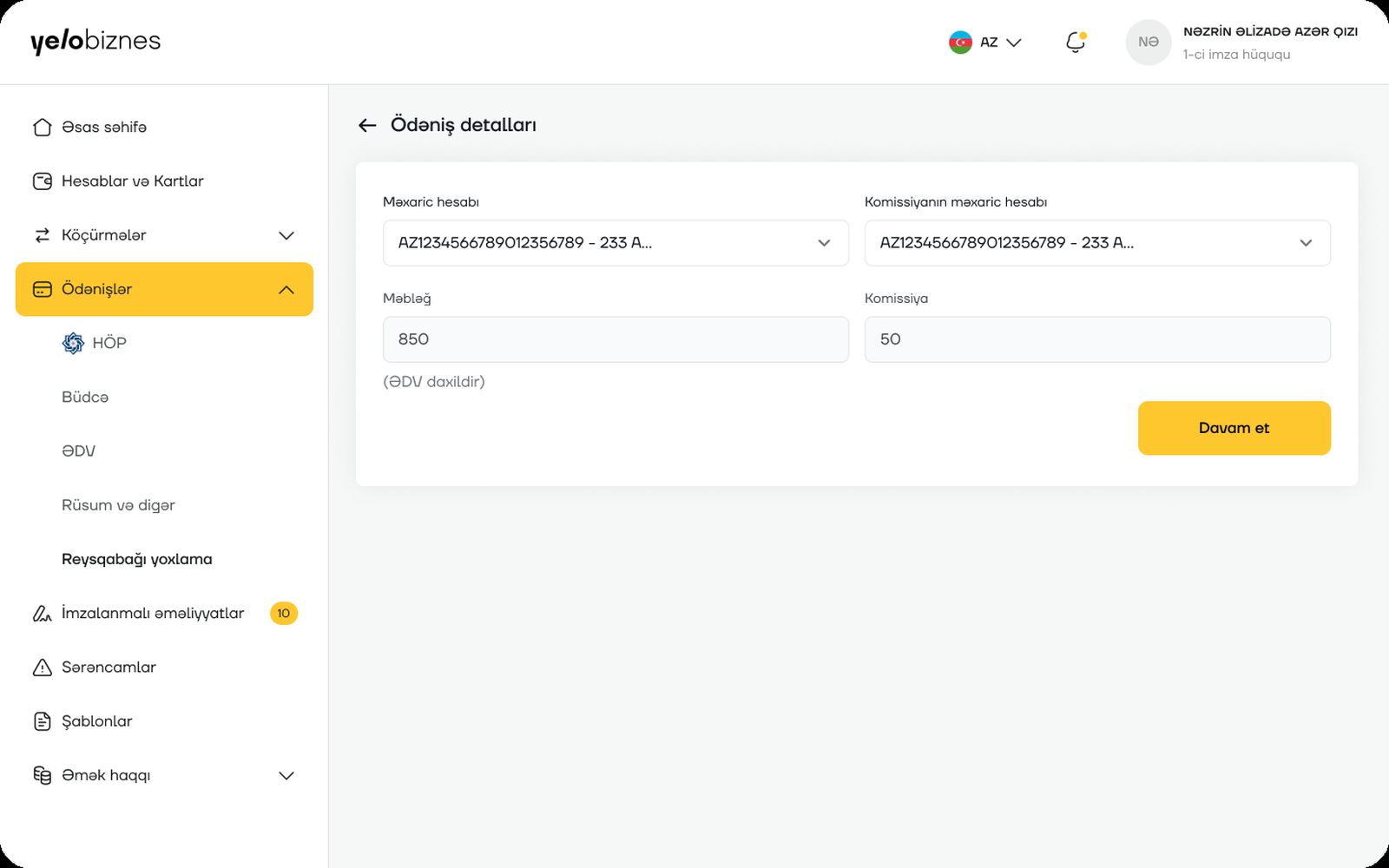
Two accounts, one confirmation
The customer picks which account pays the fee and which covers the commission, with both amounts shown plainly before confirming.
Kiron
Therapist‑matching platform
Overview
Kiron helps people find a therapist who actually fits them — by specialty, language, availability and approach — instead of scrolling an unfiltered directory. This was a full web design pass: personas, type and color system, a responsive grid, and complete desktop and mobile builds for the patient‑facing site.
Personas first
Two grounded personas — Aylin, a marketing specialist quietly overwhelmed by burnout, and Kamran, an HR manager whose long hours leave no room to search — shaped every decision that followed: what the platform needed to prove before someone would trust it with something this personal.
System & screens
DM Sans carries the whole interface — geometric, clean, legible at a glance — paired with a calm palette (soft sky, iced blue, calm gray) built to feel steady rather than clinical. The grid, desktop layout, and mobile flow that follow all use it consistently, from the "How Kiron works" steps to the therapist selection and blog sections.
